Reading TikTok Watch Time and Retention Graphs
Learn where viewers drop off in your TikTok videos.

TikTok gives every creator a second-by-second picture of audience behavior that most platforms do not match, and finding it requires a specific path that is easy to miss on first try. From the app, a creator goes to Profile, then Menu, then TikTok Studio, then Analytics, then Content, then taps into an individual video. That last tap matters. The aggregate dashboard tells a creator very little on its own; the per-video screen is where the real diagnostic work happens.
Three numbers sit at the top of that per-video screen, and they need to be read as a set rather than one at a time. Completion rate, sometimes labeled watch time percentage or retention rate, measures the share of viewers who reached the final frame, and Shortimize describes it as arguably TikTok's most important metric and the algorithm's primary quality signal. The retention graph itself, which produces this second-by-second curve, is what makes TikTok's analytics unusually useful compared to what other platforms disclose: it shows where viewers left, where they looped back, and what percentage of the original audience survived to any given point in the timeline. A single completion percentage tells a creator that people left. The curve tells them when, and often why. None of the three numbers means much without knowing how long the video runs, and that relationship between length and target percentage is the subject the next section takes up directly.
Why the algorithm weights retention so heavily
TikTok's For You Page distributes video primarily according to how much of it people actually watch, which makes the platform more retention-driven than Instagram or YouTube, both of which balance watch time against saves, shares, and other engagement signals. That single design choice explains why the graph deserves close reading rather than a glance at the top-line percentage.
The algorithm tracks two retention signals at once and rewards both of them independently. One is completion rate, the percentage of the video watched, functioning as a quality signal. The other is absolute watch time, the total seconds accumulated across viewers, functioning as a volume signal. Combined, these two signals produce a result that runs against intuition: a longer video with a lower completion percentage can outperform a shorter video with a higher percentage, simply because it generates more total seconds watched per viewer. OpusClip's analysis of 500 videos found that videos averaging 70% watch time drew 4.3 times the impressions of videos averaging 40% watch time, even in cases where the lower-retention videos had collected more likes. Likes did not save those videos from underperforming on distribution. Watch time did the work.
Replays intensify both signals simultaneously. Retensis has also reported that TikTok's algorithm now evaluates retention at fixed checkpoints, specifically at 3, 10, and 20 seconds for longer videos, and restricts further distribution when viewers drop off early at those checkpoints. Because the algorithm checks retention at those fixed checkpoints, the graph is not simply a record of what already happened; it functions as a forward-looking signal the algorithm consults while deciding how far to push a video into new feeds. The system is also unforgiving toward hooks that spike attention for two seconds and then collapse, favoring instead curves that sustain engagement across the opening stretch. The shape of the graph carries as much weight as its average level. A creator who only checks the average watch time number is missing the part of the analytics screen the algorithm itself is built around.
Target retention percentage by video length
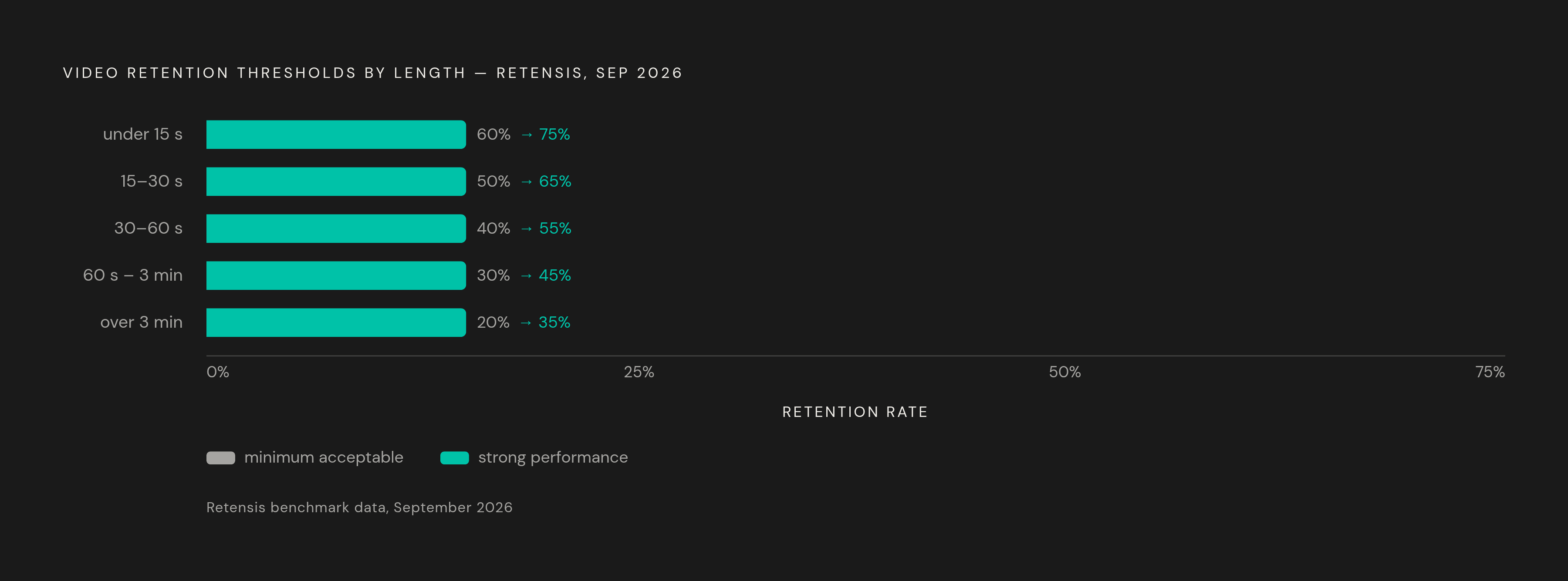
No retention number stands alone. A 45% average watch time is a serious problem on a 15-second clip and a genuinely good result on a 3-minute video, because the target moves with length, and applying one universal benchmark across every video length leads creators to misdiagnose videos that are actually performing fine. Retensis's benchmarks, updated in September 2026, lay out targets tied to specific length bands, and those bands are worth walking through in order. For videos under 15 seconds, the target is above 60%, with anything above 75% counted as strong, and anything above 85% usually indicating that viewers are replaying rather than simply finishing the video in one pass. For videos between 15 and 30 seconds, the target drops to above 50%, with above 65% considered strong. Between 30 and 60 seconds, the target is above 40%, with above 55% strong. For videos running from 60 seconds to 3 minutes, the target falls to above 30%, with above 45% counted as strong. And for anything longer than 3 minutes, the target is above 20%, with above 35% strong. The pattern across all five bands is consistent: longer videos are expected to retain a smaller share of their audience, because holding a viewer's attention for a larger absolute number of seconds becomes proportionally harder as the runtime grows.
The algorithm tracks two retention signals simultaneously and rewards both, and Retensis's cross-platform benchmarks show that average retention on videos under 30 seconds rose from approximately 45% in 2025 to 50% in 2026, a shift that reflects a feed that has grown more competitive rather than a change in what counts as engaging content. Content category shifts the baseline further still: educational content tends to post watch-to-end rates well above the cross-category average, so a creator working in a high-retention niche should measure their videos against others in that niche rather than against the platform-wide figure, which would understate how well or poorly they are actually doing. The most reliable comparison, in practice, is a creator's own recent videos at a matching length and in the same niche. Published benchmarks work as a starting point and a sanity check, not a verdict on any single video. A run of several videos landing consistently below the target for their length band is the pattern worth acting on. One outlier below target, on its own, is closer to noise than signal.
Reading the first three seconds: diagnosing a hook problem
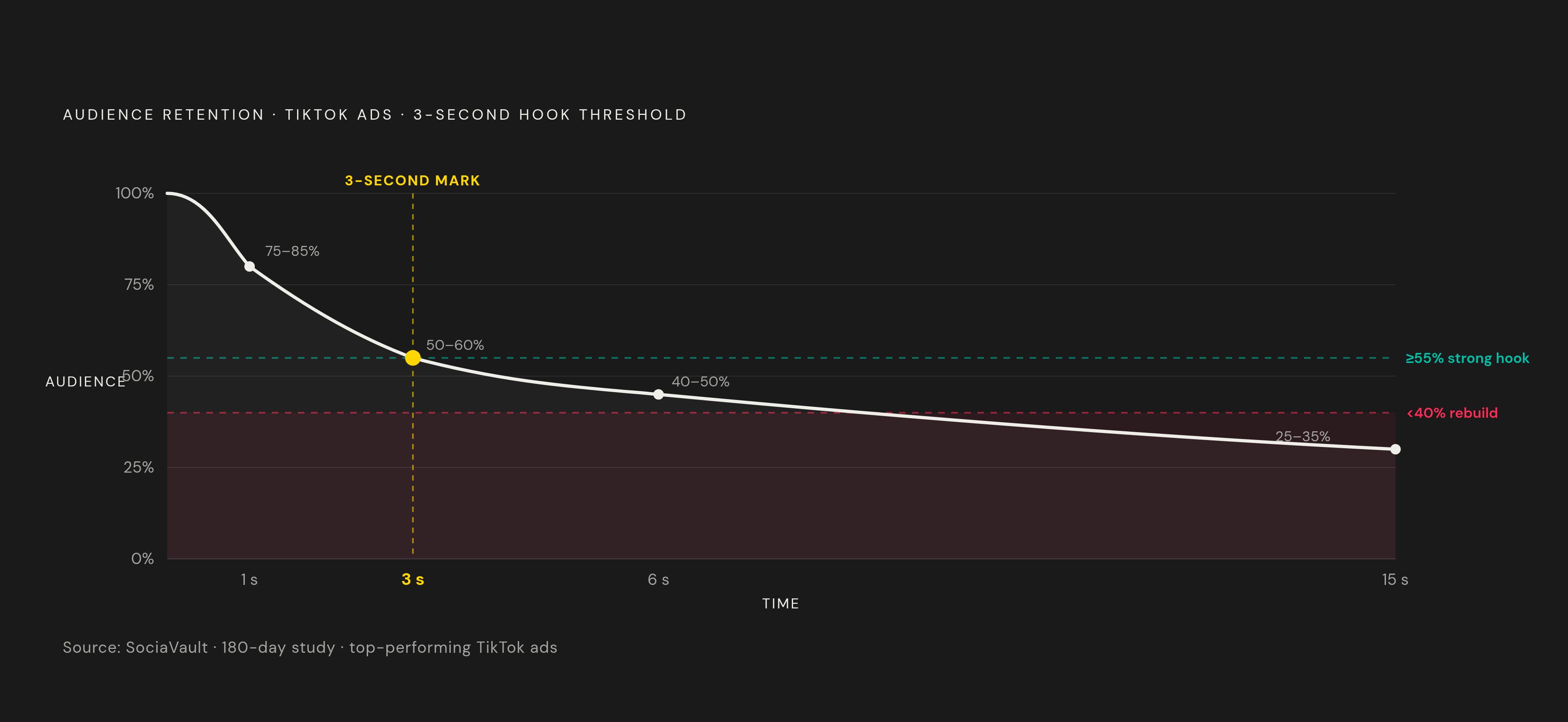
The steepness of the drop in a video's opening seconds is the single most diagnostic feature on the whole retention graph, because it shows directly whether the hook converted an impression into an actual viewer, and everything that happens later in the curve depends on who is still there to see it. SociaVault gathered second-by-second data from top-performing TikTok ads across a 180-day window, and that data maps what a strong opening curve looks like in practice. At the 1-second mark, 75 to 85% of viewers are still watching. By 3 seconds, that figure has settled to 50 to 60%. By 6 seconds, it is 40 to 50%. By 15 seconds, 25 to 35% remain. These figures describe a ceiling, drawn from already high-performing ads, so an average organic video will show a steeper drop across the same span.
SociaVault sets a clear threshold on that 3-second mark: 55% or higher still watching indicates a strong hook by top-performer standards, while anything below 40% signals a hook that needs to be rebuilt from the ground up rather than adjusted at the margins. A drop of more than 30% within those first three seconds means most of the people who saw the opening frame chose to leave, and that pattern on the graph is a hook failure, distinct from a pacing failure elsewhere in the video. TikTok treats early drop-off as its own tracked signal: viewers who leave within 5 to 10 seconds of an engaging hook get registered as encountering a bait-and-switch, and that registration triggers algorithmic suppression of the video. Stack Influence has found that strong hooks hold 80 to 90% of viewers through the first 3 seconds and then ease into a gradual decline from there. That gradual slope, visually, is the shape to look for on the graph: a curve that eases downward rather than one that falls off a vertical wall and then flattens.
Hook formulas wear out. A 2025 TikTok Creator Digest study found that the lifespan of a trending hook format shrank from 8 weeks in 2023 to 3.5 weeks in 2025. A hook that looks fresh on the graph this month can start reading as a skip signal within weeks. On the retention curve, that decay appears as a worsening drop at the 3-second mark across a series of similar videos, even when nothing else about the production has changed.
What a mid-video cliff reveals about pacing
A healthy opening curve followed by a sharp drop between 8 and 15 seconds points to a different failure than a weak hook. The hook did its job; the follow-through did not, and the video generated curiosity it then failed to satisfy quickly enough, which calls for a different edit than a hook rebuild would. Where exactly the cliff appears in the timeline narrows down which specific failure occurred. A cliff landing at 8 to 10 seconds usually means the hook promised something the video did not deliver on the schedule viewers expected: they extended a grace period, did not get the payoff within it, and left. A cliff landing at roughly 75% of the video's total length usually points to the ending rather than the middle: the video resolved, or looked like it had resolved, before it actually reached its final frame, and that gave viewers a logical exit point they took. A slow, even decline through the middle stretch, without any sharp cliff at all, describes a pacing problem rather than a broken promise: nothing is actively pushing viewers away, but nothing in the middle is re-engaging them either.
OpusClip's data on this is specific. Videos that include a pattern interrupt every 4 seconds average 58% retention, against 41% for static talking-head videos with no such interrupts, and that 17-point gap is wider than the retention gap tied to video length in the same dataset. That comparison matters because it means editing choices in the middle of a video move the needle more than length decisions do, for holding the middle portion of the curve. Pattern interrupts work by resetting viewer attention at the point it is statistically most likely to decay, and the relevant variable is timing, roughly every 10 to 15 seconds in any clip running longer than 30 seconds, rather than any particular editing tactic. Captions play a related role. OpusClip has found that accurate, burned-in captions produce a measurable retention lift, largely because a large share of early views happen with the sound off; captions let a silent viewer follow the video without unmuting it, and each new line of caption text functions as a soft pattern interrupt in its own right.
What an end-of-curve bump reveals about replay behavior
A visible uptick at or near the 100% mark of the timeline is a real signal in the data. It is the retention graph directly showing that viewers looped the video back to the start, and it is the strongest positive engagement signal the graph is capable of displaying. Everything about rewatch behavior needs a caveat attached, though: TikTok does not publish loop data, so every benchmark in circulation is a vendor estimate rather than a platform-confirmed figure. TT Calculator's 2026 benchmark model puts the estimated loop rate at 42% for 7-second clips, falling to 28% at 15 seconds, 15% at 30 seconds, 6% at 60 seconds, and 0.1% at 10 minutes. That decay curve is steep, and it tells creators that rewatch is fundamentally a short-video phenomenon rather than something to expect from longer content. Content category shapes it further: comedy and dance content top the loop rankings at the 15-second length, while storytelling content sits at the bottom of the same ranking. The bump is more likely to show up on some kinds of videos than others regardless of how well they are edited.
The mechanics behind why a bump matters so much come back to the same arithmetic covered earlier: a replay adds watched seconds without adding a new unique viewer, so a 30-second clip replayed twice by the same person generates the same total watch signal as a 90-second clip watched once by someone else. That arithmetic is why seamless loop endings, where the final frame visually or narratively connects back into the opening frame, have become a deliberate structural choice among TikTok-native creators. They build for the loop because the graph rewards it, and the bump at the end of the curve is the direct evidence, on that specific video, that the loop worked. Because no official benchmark exists, the three vendor thresholds now circulating disagree even in what they measure. Darkroom Agency treats 20 to 30% as a strong rewatch rate on short clips. Socialync sets the bar at above 15 to 20% for an excellent rate. Retensis instead measures a replay ratio and treats anything above 1.2 as a signal of stronger distribution. None of these three numbers describe the same underlying quantity, and none are platform-confirmed, so a creator should treat all three as directional pointers rather than precise targets. The more reliable practice is to watch for the presence, shape, and location of the bump itself, rather than to chase a specific percentage borrowed from an agency's client data.
Average watch time versus completion rate
A creator who understands average watch time and completion rate individually can still misread a graph when the two numbers disagree with each other, and that disagreement is common enough to need its own decision rule. A video can post a high absolute watch time alongside a comparatively low completion percentage, while a shorter or tighter video posts a lower absolute watch time with a much higher completion percentage. Both patterns appear regularly in TikTok analytics: they measure different things, and the algorithm consults both.
The clearest illustration of this split comes from OpusClip's 500-video analysis referenced earlier: videos averaging 70% watch time drew 4.3 times the impressions of videos averaging 40% watch time, even in cases where the lower-retention videos had accumulated more likes. Likes are a separate engagement signal, and a healthy like count did not compensate for weaker retention in that comparison. The decision rule that follows from everything else in this piece is straightforward. Completion rate should be read against the length-specific benchmarks laid out earlier, since it answers whether the video is satisfying, proportionally, for its own runtime. Average watch time should be read as the volume figure that determines how many total seconds of attention the video is contributing to the algorithm's distribution calculation, independent of length. The algorithm tracks these two retention signals simultaneously and rewards both, so reading the graph well means tracking both levers at once.
Sources
- Compare Watch Time: TikTok Vs Reels Vs Shorts (2025)
- Ideal TikTok Length & Format for Retention (Data-Backed) - OpusClip Blog
- TikTok Scroll-Past Rate Statistics 2026 [Data] - TTS Vibes
- TikTok Rewatch Rate Statistics 2026 - TTS Vibes
- Average Retention Rate for YouTube Shorts, TikTok, and Reels in 2026
- TikTok Retention Rate Benchmarks 2026: What Good Looks Like by Video Length